We all love backlinks. We all love visualisation. Boom! Let’s mash those two things together. In this post I’ve collected a bunch of different techniques for visualising your link data. Some of these are useful for analysis, some are useful for management and some are useful for keeping Dr. Pete entertained…… 🙂
Which Are My Top Folders
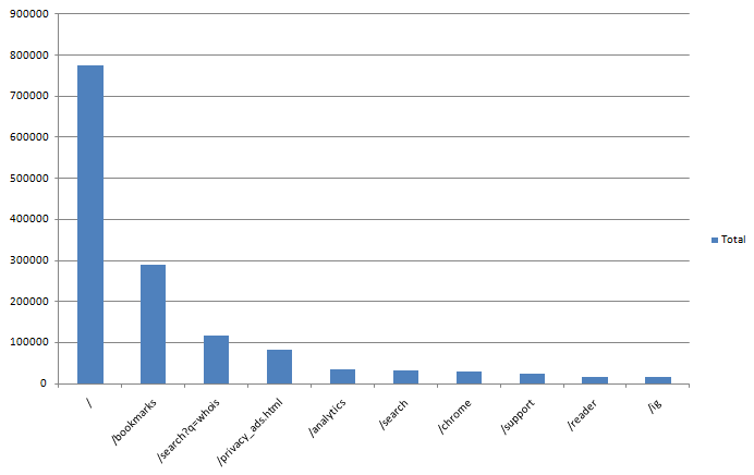
The top pages function of OSE is one of the most useful features ever. Ever since I saw the first incarnation in labs I’ve been a heavy user of this tool but Rich Baxter has taken things one step further yet again and given us a way to see the top linked to folders on a site. Here are the most linked to sub-folders and pages on www.google.com:
Get the step by step walkthrough to creating your own version of this over on seogadget.
Creating Geo Link Maps
Yes, I know that this involves a competitor. But the graphs are too super cool not to share! Take a look at the geomap of Distilled’s backlinks:
Anyone would think we have a presence in the US or something! To learn how to make your own version of this go check out Wiep’s wonderful article. You never know, one day this feature might be native to either OSE or Majestic…. I can but dream 🙂
Pretty Tag clouds
Ok, we can probably file this one under “not management friendly” but you never know. If you do SEO for a dinosaur website….

These are the top anchor texts for SEOmoz visualised as a keywordasaurus. Hat tip to Dr Pete and SeanWF for this tool: http://www.tagxedo.com/app.
Visualising Directory Links
When quickly scanning a site’s backlink profile there’s a few different things that I look for more or less straight away. One of those is the split between quality links and umm non-quality links. It’s not that the non-quality links don’t work (depends how bad they are!) but the quality links are almost always the more interesting ones to analyse. These are the ones you really want to copy from your competitors. If you download an Open Site Explorer report into excel and then create a new column and paste the following formula in:
=IF(IFERROR(FIND(“directory”,A2),IFERROR(FIND(“directory”,B2),IFERROR(FIND(“Directory”,B2),0)))>0,”Y”,”N”)
This formula is a little messy but basically just looks to see if either the URL or page title contains “directory”. While this doesn’t catch everything I’ve found that it get’s you a long way there very easily. That will then let you create a nice little pie chart like this:
Venn Diagrams
Kelvin recently wrote a very interesting piece on creating venn diagrams between your links and competitor’s links that looks a bit like this:
Kelvin has a nice handy video that walks you through how to create these charts (which I think are super management friendly!) over here.
Broken Links
I know this tool has been written about before and it’s not technically a visualisation as such, more of a visual representation of your links but I love how quickly you can see which of your links no longer exist using Carter Cole’s chrome extension “SEO site tools“:
Of course, with yahoo site explorer not hanging around for much longer it’s useful that this tool also works with Google Webmaster Tools:

I like this view, especially when I’m looking at a particular page as it gives me an indication of how many actual links might be pointing at the page and how many might have dropped off recently.
SEOmoz Labs
While this tool has been around for ages some of you might not know about it and especially some of you might not know how awesome this is for sales and non-technical people! Our sales team uses these kinds of charts all the time to quickly and easily get an overview comparison of a brand new website that they might be on the phone to:
Get your own one of these over in SEOmoz labs.


