Imagine launching a company without any research or a business plan — without having a concept of the market size, nor even knowing if there are any competitors. It would be absurd, right?
As an entrepreneurship major in college, I spent a full year working on business plans, which are integral to a solid strategy and the backbone of most successful companies. Even the businesses that “got lucky” started with some semblance of a framework early on.
Sure, there has been talk about business plans being dead; however, it’s more about reducing the size of your plan, simplifying, and making sure goals are realistic — and never about eliminating the plan.This is actually how the pitch deck was born.
But planless, oddly enough, is just how many content marketers (even those at decent-sized companies) start off.
“Let’s just get some blogs out there.” Or, “How about we send an email this week?”
Actually, only 27% of B2B content marketers have a documented content strategy.
As both a planner and a content marketer, fact gives me mild heart palpitations. So many ships out to sea with zero navigation.
But it’s actually good news for you. It means that of the 2 million blog posts published every day, the majority are not properly optimized. So with a little bit of groundwork, you can position yourself to stand out from the crowd,
A content marketing strategy helps you define your target market so you know who to write to and what to write about. Your research will uncover the journey the customer will follow, from discovering about your business to making the decision to buy. It will also help you address any key decision points along the way.
Once you’ve done your share of content research, you have a database of decision points which you can use to create a visual roadmap of your content strategy. Personas are great for understanding your target market, style guides give you direction for design and SEO best practices, and distribution lists help you remember what to do to promote your hard work.
But you should visually map out the customer journey if you really want to get inside the customer’s head and understand each point in the decision process.
Visualizing the content journey
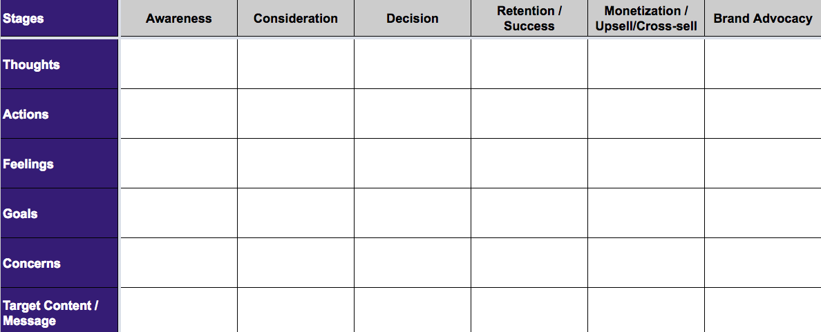
I work at an agency, and one of the first things we do when we start working with a client is map the buyer’s journey potential customers will take from discovery to purchase to brand advocate. There are a lot of ways to do this, but we like to start with a buyer’s journey matrix like this:

Each of the points in this matrix highlights the content creation basics: who, what, why, when and how. This process can be incredibly helpful for building out a thorough content calendar. But it starts to get complicated, quickly.
How many emails should they receive to help them make a decision? And what (if any) blog posts help a person be successful enough during their free trial that they convert into a paying customer? The list of questions could go on and on.
Visually mapping out key interchanges between multiple types of content will help smooth out the process and prevent key steps from being missed.
We use a product called LucidChart (a paid tool that has a free version), but you could use Google Docs or any number of other tools.
Visually mapping a lead-nurturing workflow
Let’s start with one of the heavier hitters first.
Lead nurturing is an art, not a science. When done poorly, lead-nurturing emails are at best a nuisance and at worst can actually drive people away. So you want to get them right.
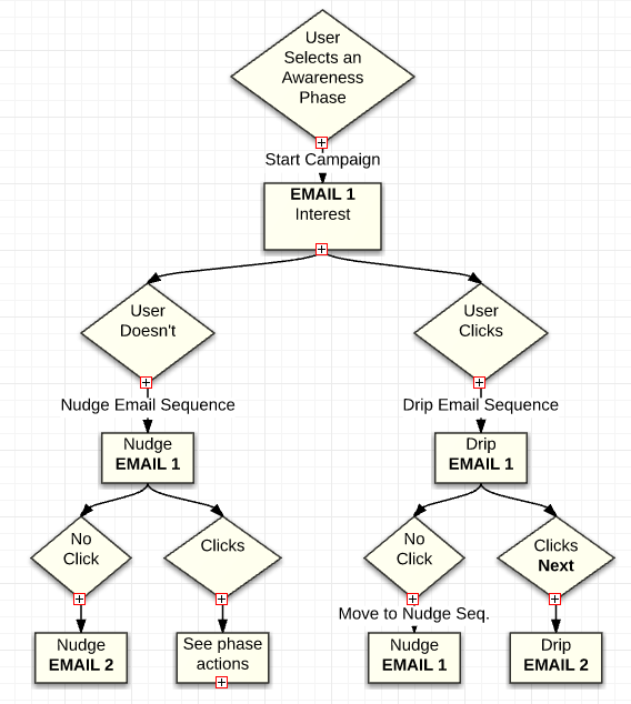
There are two tracks to lead-nurturing emails:
- “Nudge” emails to get someone who has been ignoring you to start paying attention
- “Drip” emails to help move a lead along the marketing funnel
A visual map will help time these emails and plan their content. A map may look something like this:

You could easily add timestamps to your visual plan and any other information that helps clarify the strategy. We link these notes to a separate document with the full content descriptions that are unique to the project.
Clarifying a multi-step content process
If you couldn’t already tell by my mentions of “free trials” and other SaaS terms, we do a lot of work with subscription software companies. Part of that marketing process is onboarding a customer to the platform. This is a critical area for optimization which causes a lot of drop-offs, particularly if there is a free trial involved. Much like eCommerce, or any other online process that involves moving through a “checkout,” it’s important to fully understand the pain points a customer may have throughout this multi-step journey.
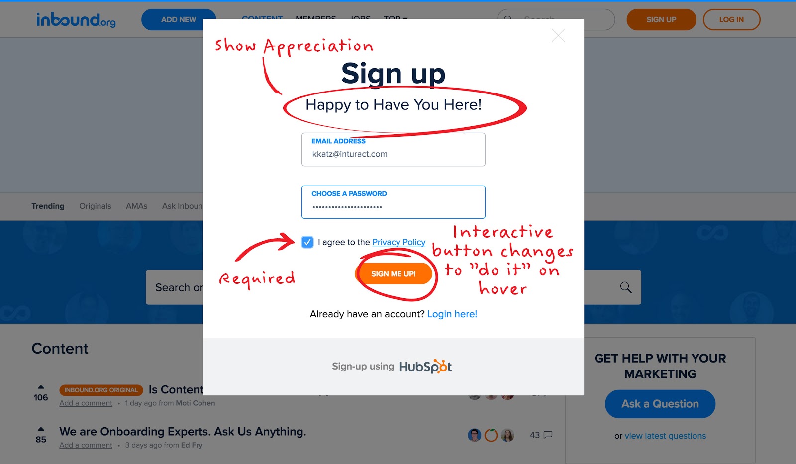
You can visualize their experience to improve your strategy by taking a screenshot of each step in the process. Take note of the content, language and design. This will help unify the marketing team toward customer optimization. It will also ensure you are delivering an optimal process that cuts down on those pesky drop-offs.

Use a preferred document platform to map out each of these phases with important notes so that you can optimize for changes and uncover true bottlenecks in the process.
This can be particularly helpful if your onboarding process includes outside educational material, including blog content or eBooks, which aim to improve customer success, because now you are getting into the territory of jumping around between platforms. Whether you are using email, or a tool like Intercom.io to deliver supporting information, you will want to map it out ahead of time to ensure you’re answering all of the right questions.
It’s time to get personal
Onboarding, lead nurturing, and content marketing, in general, all work better with a little personalization. There is a reason the term “personas” is a buzzword on par with Beyonce’s latest lyrics.
Personalized content helps your audience form a deeper connection with the message you’re delivering.
Content personalization can be as simple as writing specific content to a persona. But it increases in effectiveness when you utilize data to take that content to the next level of hyper-personalization.
For example, you might provide a form that asks someone what their job title is.
This allows you to send them an email that specifically addresses questions someone in that particular position may have. The questions that an entry level sales rep is hoping to answer are very different than those of the company’s chief technology officer. You may be targeting both of these people with your product, but your marketing will be more effective if you get straight to the heart of their unique desired outcomes.
Whether or not you actually like forms or pop-ups, they can be an incredibly effective way to clear out the clutter for your audience in the long run. But getting this deep into data requires an extra level of planning to be sure you are again answering the right questions.
Visually mapping out the different content sequences at the point in which they branch off will help you avoid mistakes and ensure that you deliver the most effective content throughout the customer journey.
Do you map out strategies ahead of time? What are some of your favorite tools?


